web, graphic & design
optionsList of web and graphic design, development projects of Pejman Tayebi Design Studio located in Rasht, Gilan, Iran
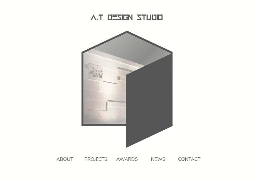
at-arc.com
2020, web design and development
The design of this website was based on creating an interactive connection between the user and the former logo of Amirhossein Tabrizi Architecture Studio, which combined a house, a cube, and a door. The user could open and close the door and experience every sections of the website as if they emerged from within the logo itself. This core idea was developed and enriched through an horizontal scrolling system and parallax effects (where different elements on the page move at different speeds while scrolling, creating a sense of depth) and gradually took shape. Due to the studio’s rebranding and name change, the original website is no longer online. However, a simplified version with limited content is hosted on my personal server, and you can explore and experience this version firsthand.
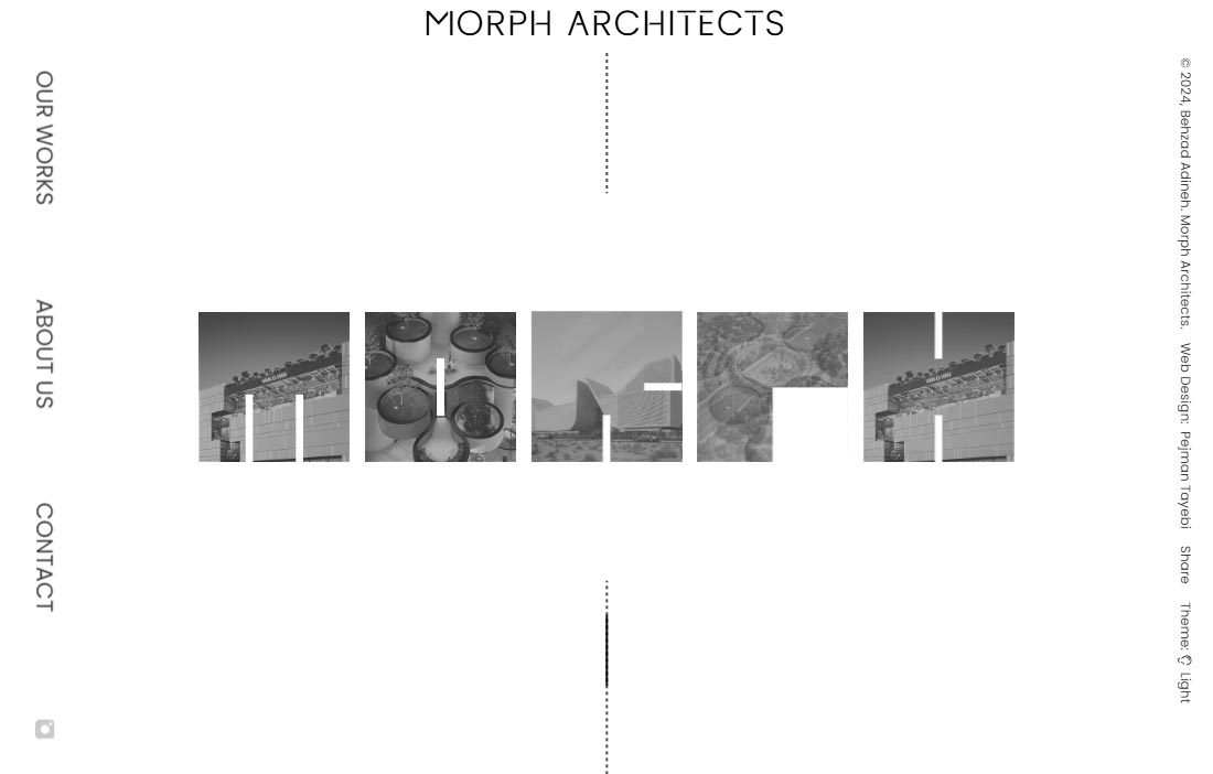
morph-architects
2023, web design and development
At the beginning of the design process for Morph Architecture Studio, led by Behzad Adineh, we looked back at the literal meaning of the word “Morph.” Morph means the gradual transformation from one form into another. The design of this website is inspired by this very concept. Upon entering, users experience how the English letters of the logo smoothly transform into one another, eventually forming the main logo, a logo that contains images of key architectural projects. Another distinctive feature lies in the scrolling behavior: when the user reaches the end of the page, the scroll motion loops back to the beginning, a gesture that echoes the same continuous process of morphing and transformation.
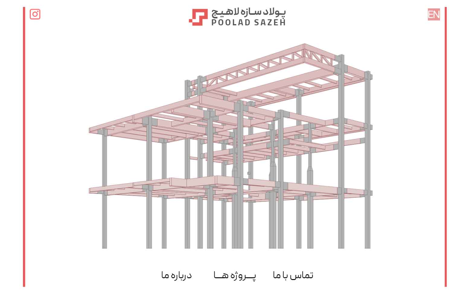
poolad-sazeh.com.com
2021, web design and development
One of the leading companies in the field of welded and bolted steel frame structures, Poulad Sazeh Lahij is known for its collaboration with avant-garde architects. In designing the website for this industrial company, the main goal was to emphasize “the collaboration between the company and architects”, and the website design is more graphical and minimal rather than text-driven. The design process began with the company logo and continued with the programming of a motion graphic, which was then completed with horizontal scrolling. The website is bilingual, and one of its main challenges was aligning the right-to-left Persian text with the left-to-right horizontal scroll, ensuring a smooth and seamless user experience in both languages.
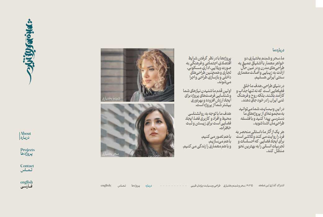
bakhtiaristudio.com
2024, web design and development
The design of the website for Sahar & Shabnam Bakhtiari Architecture Studio was based on the logo they provided. Created using Persian calligraphy, the logo had a vertical orientation, and the website design needed to be developed in harmony with this unconventional unconventional vertical form. Initially, two separate motion graphics were designed and programmed for this logo. If a user visits the site for the first time in a browser, a longer animation is displayed, whereas shorter animations are shown when navigating between pages. The homepage was designed so that the logo appears in the foreground, while in the background, images of the projects completed by this architecture studio are displayed. The layout and programming of the main navigation menu, which has an unconventional arrangement, were carried out in coordination with the same vertical logo. The website is bilingual, and one of its main challenges was coordinating Persian and English fonts with the logo.
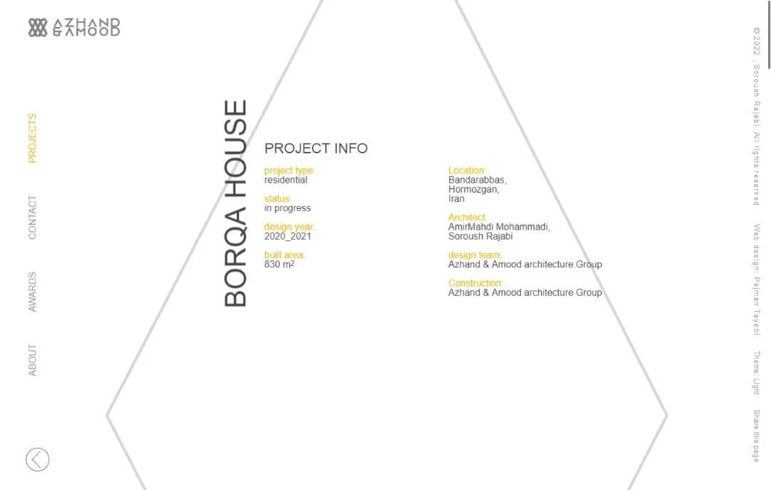
azhand-amood
2021, web design and development
The design of the website for Ajand & Amood Architecture Studio, led by Dr. Soroush Rajabi, began based on the logo they provided. This logo featured diamond-shaped forms composed of diagonal lines, so the website design needed to be developed in harmony with this structure and overall form. Initially, a motion graphic was designed and programmed for the website logo to make the user’s first visit more engaging. Upon the first visit and before the full website loads, the user first sees the logo as lines. Gradually, these lines fill in, forming the complete logo. In the next stage, images of projects designed by the studio slowly appear within the logo, creating a dynamic and visually appealing effect. The layout and programming of the main navigation menu were also developed in coordination with the logo, using a diamond-shaped arrangement to create a cohesive and unified visual experience. Subsequently, different sections of the website (About Us, Contact, and Projects) were designed and programmed in accordance with the overall structure and form, ensuring that all elements remained in complete harmony with each other. The website features two distinct color modes: light and dark.
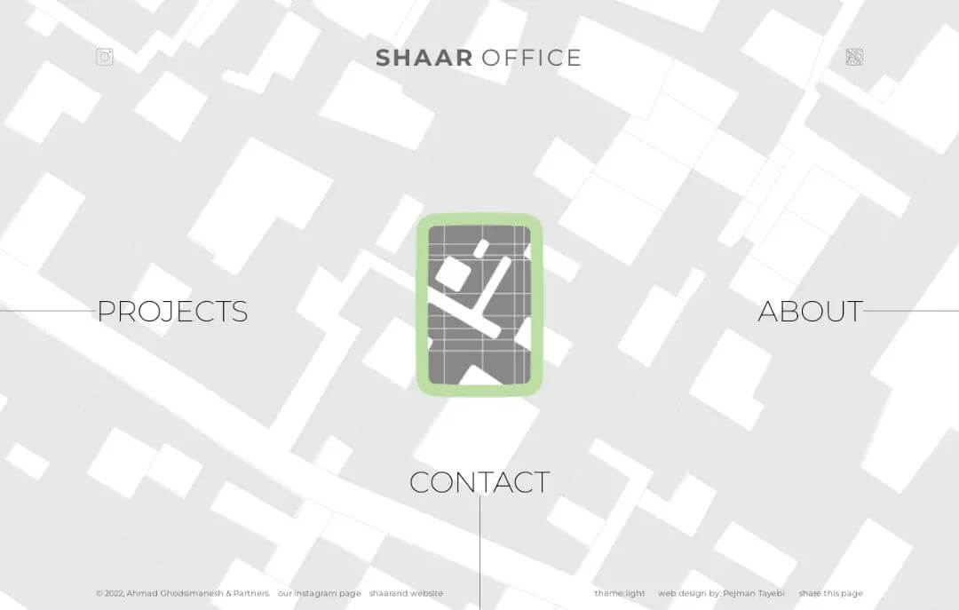
shaaroffice.com
2022, web design and development
The design of the website for Shar Architecture Studio, led by Ahmad Ghodsi Manesh, began based on the logo they provided. This logo was inspired by an urban texture and featured a framed section of the city of Shiraz. Our goal was to bring the concept behind the logo to life within the website. Initially, users see an image of the urban texture lines as the background. Then, a part of these lines is highlighted and framed in a border; this highlighted section represents the logo, which gradually emerges from the lines. Instead of placing the website’s different sections on separate pages, they were designed side by side, so that navigating between them feels like moving from one point of the city to another. When this movement is combined with the background urban lines, it creates the sensation that the user is walking and exploring a real city map. Moving left and right displays the About Us and Projects sections, which are navigated using horizontal scrolling. Moving downward reveals the Contact section. The website also featured two color modes: light and dark.
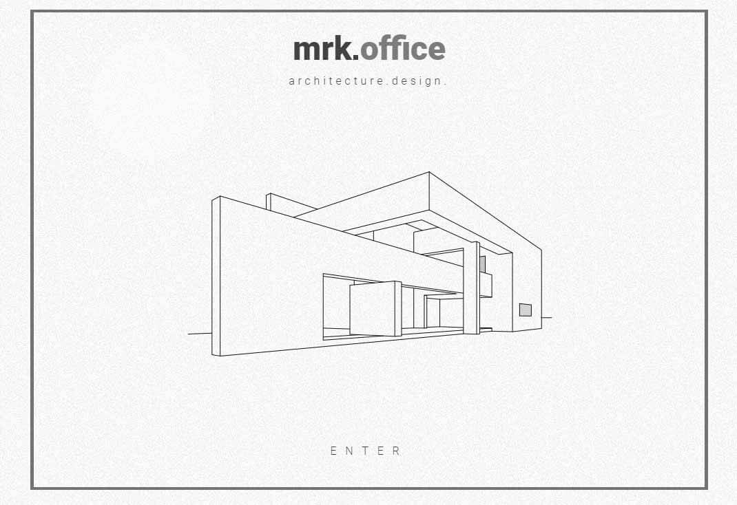
mrkoffice.ir
2020, web design and development
The website for Mohammadreza Kahzadi Architecture Office, was designed around the logo provided by the team, a simple hashtag symbol #. Although the symbol initially carried no meaning, we aimed to give it character and make it more than a passive graphic element. We reinterpreted the logo (#) as a group of small squares arranged in three-dimensional space and as four intersecting lines forming a frame. Based on this, two animations were programmed. One allows users to rotate the logo in 3D upon entering the website, exploring the spatial arrangement of the squares. The other transforms the logo into a frame around the website’s content when clicking on the studio’s name or main menu. On the About Us page, the main image of the office members was layered and given a parallax effect, creating a sense of depth while scrolling. Each team member also has two portraits, serious and smiling, which switch on hover, adding a human and playful touch.
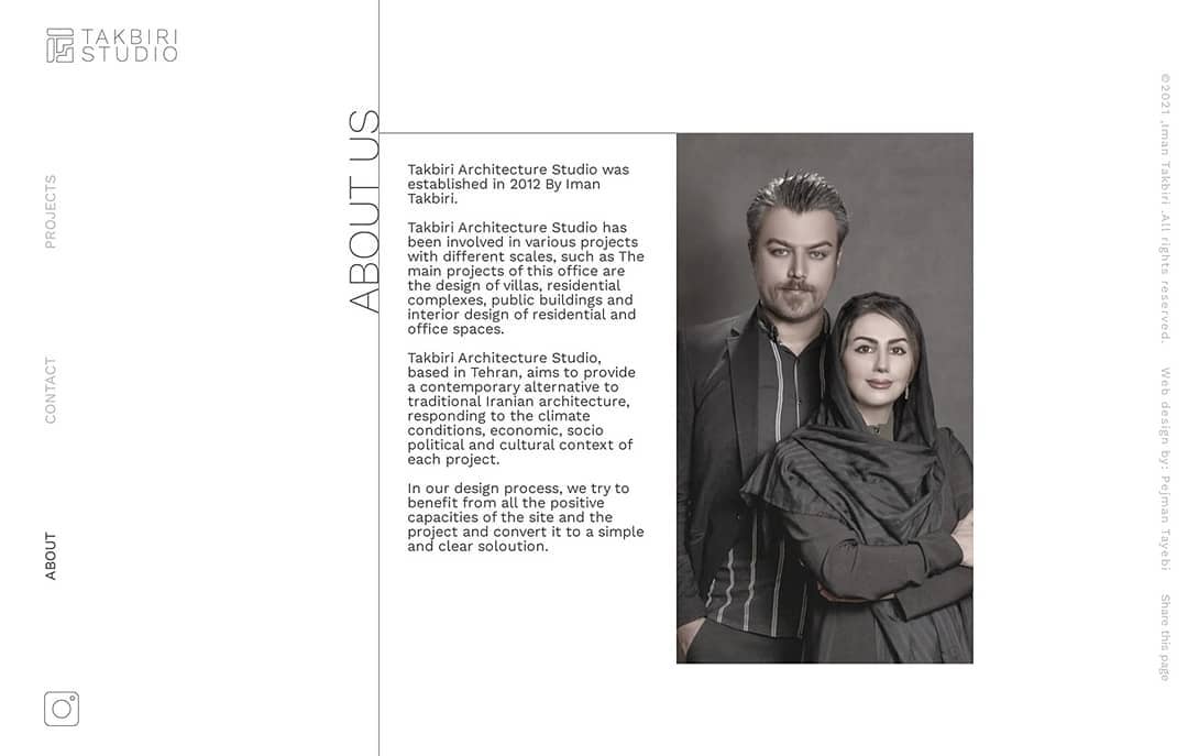
takbiristudio.ir
2019, web design and development
The Takbiri Studio website features a minimalist and modern design, where simplicity and functionality are seamlessly integrated. With a clean white background and no unnecessary decorations, the website provides a pure and focused experience for the user. The website utilizes multiple animations and motion graphics to create a rich and engaging user experience. Despite the simplicity of the design, smooth and coordinated movements throughout the site make users feel as if they are exploring a dynamic and lively space. The homepage is designed so that the logo is placed in the foreground, while the white background provides a clean and minimalist experience for the user. Within the logo, images of projects designed by Takbiri Architecture Studio are displayed. In the Projects section, various studio designs are presented in a gallery format. Each project includes both day and night images, and when the user hovers over an image, the day image transitions to night and the night image transitions to day, creating an interactive and engaging experience.
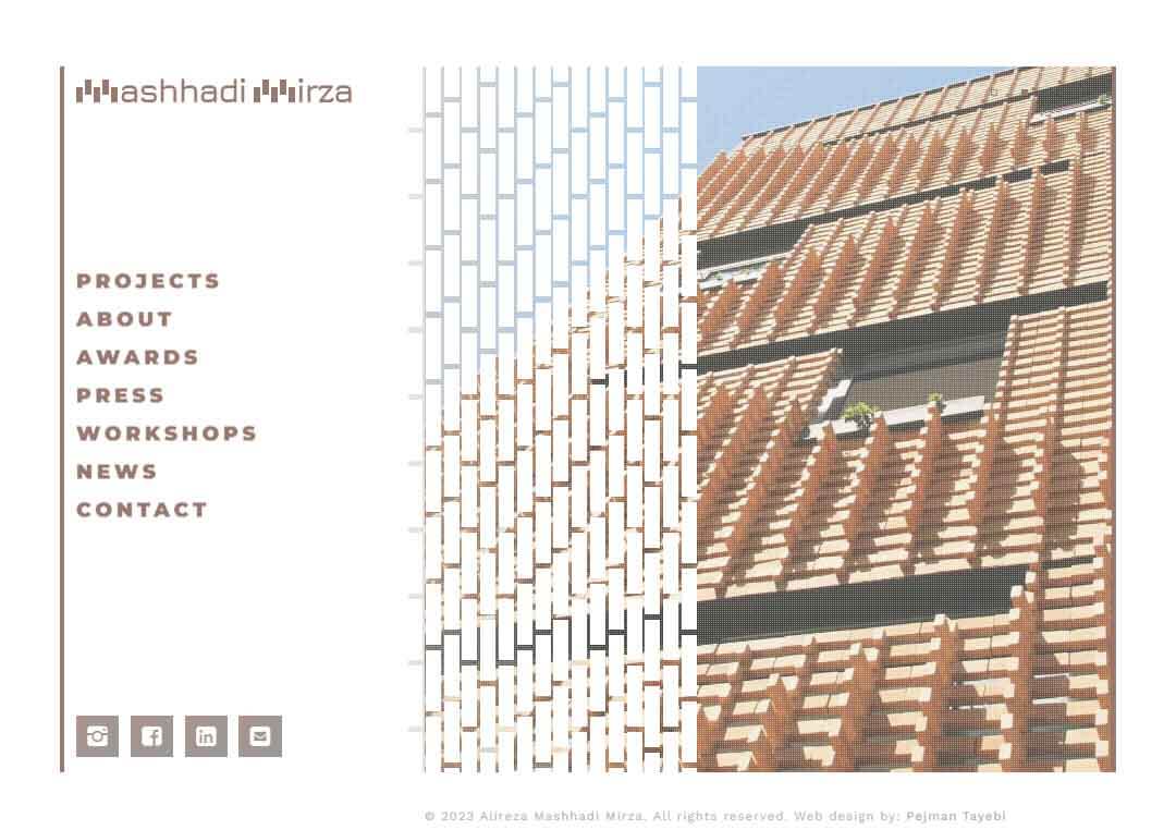
Mashhadimirza.ir
2018, web + graphic + logo design
The project for the architecture studio of Alireza Mashhadi Mirza was not limited to designing a website. It also included the design of the logo, visual identity, and a complete stationery set such as envelopes, letterheads, business cards, CD covers, and more. Therefore, the first step was to define a set of visual elements that could act as a unifying theme across all parts of the brand. Alireza Mashhadi Mirza is best known for his architectural projects that are based on the use of brick. He also holds workshops for architects where he teaches brick-based design. Accordingly, we chose the concept of brick as the core of the brand’s visual identity. The logo was designed based on this idea, with the letters M and A drawn to appear as if they were built out of bricks. A custom motion graphic was also designed and programmed for the logo, and the main brand color was selected to evoke the warm tone of brick. The homepage of the website was developed from the same concept, allowing users to explore and interact with various brick textures and arrangements. In some sections, the bricks are arranged alternately, and in others, in pairs, with these transitions animated smoothly to create a dynamic and architectural experience.

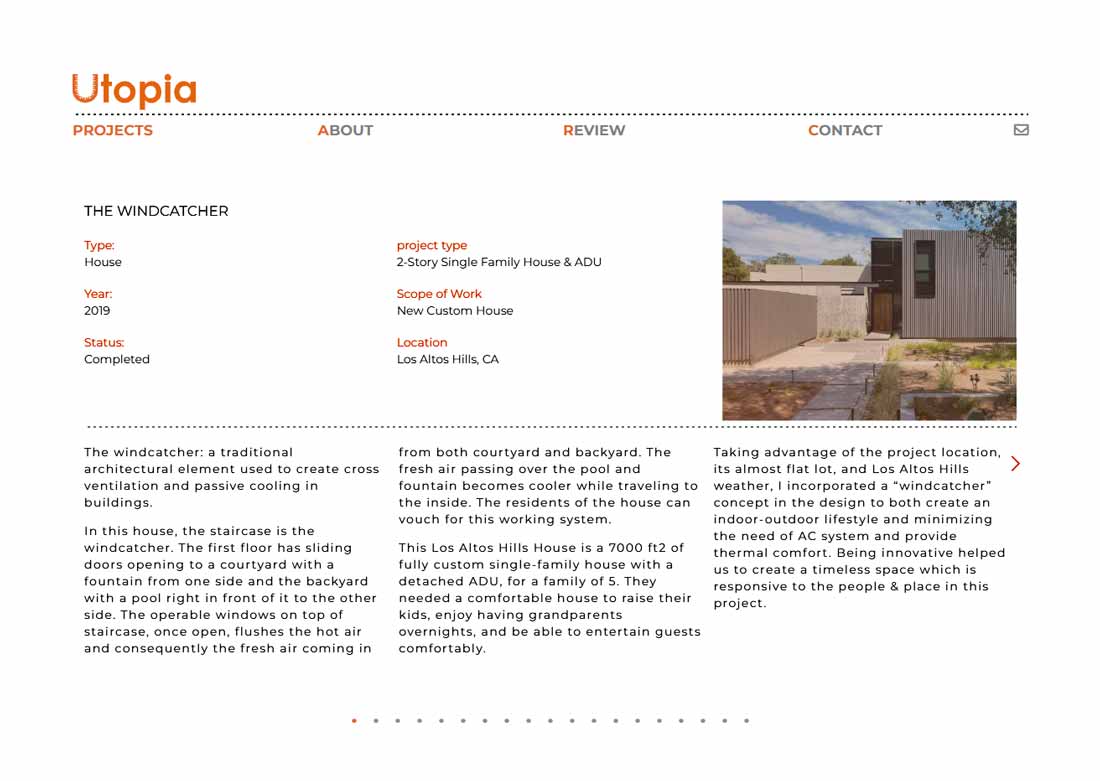
utopia designcon struction.com
2023, web design and development
This website was designed for an American company, Utopia Architecture Studio. Before this project, the company had an older website, and our goal was to create a new version that felt familiar to returning users, avoiding confusion while updating the design. The company's logo featured the word "Utopia" with the letter "U" shaped like a ruler. We embraced this idea and integrated the ruler motif throughout the website in a creative and consistent way, maintaining brand identity while keeping the overall design minimal and functional. The website also included a user review section, where visitors could leave comments and rate the company with up to five stars. This section required a backend system to manage data securely and efficiently. In simple terms, the backend is the part of the website that handles internal processes like storing user reviews, managing content, and performing calculations. It works behind the scenes and is not visible to the user but ensures everything functions smoothly. Overall, the project combined minimalistic design with functional interactivity, keeping the user experience intuitive while highlighting both the company's visual identity and its services.
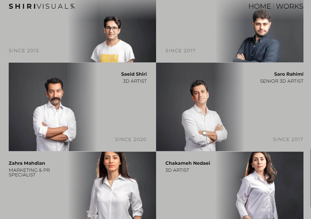
shirivisual.com
2022, web design and development
Hesam Shiri is a specialist in architectural rendering and presentation. His work primarily consists of producing high-quality videos and renderings of architectural projects. In designing and developing his website, the main goal was to create a digital space that allows the visual content to take center stage. The design was kept minimal and clean, with text reduced to the minimum so that the focus remains entirely on the images. The website was designed in a full-screen layout to immerse the viewer in the visual experience. Even the Hesam Shiri logo appears only briefly at the beginning, allowing visitors to immediately engage with the imagery afterward. A custom system was developed to display project titles dynamically, appearing relative to the position of the user's cursor. This feature made the interaction with the images more vivid and engaging. Another notable feature of the website was its ability to display 360-degree panoramic images. A dedicated video player and a specialized panorama viewer were custom-built and seamlessly integrated into the site's minimal and cohesive design.
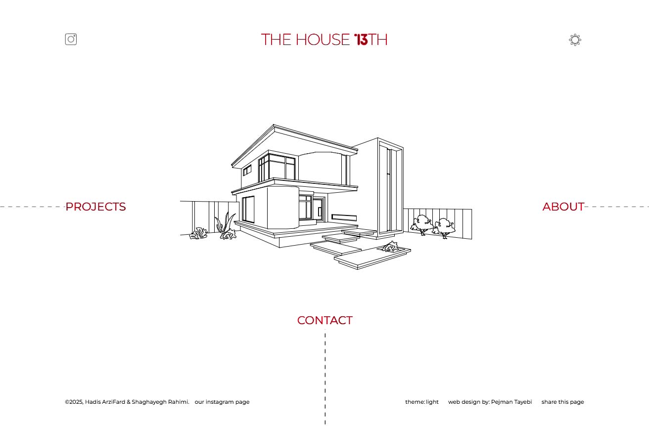
house13th.com
2025, web + graphic + logo design
The project for House 13th Architecture Studio began with the design of its logo and visual identity. At first, the idea was to create a logo resembling a small house with a pitched roof. However, as the design evolved and following the client’s vision, we moved toward a more conceptual approach. The final logo took the shape of a lock: a subtle metaphor for the act of entering a home. When we arrive at our house, the first thing we do is insert the key and unlock the door. This logo captures that very moment. Since both the website’s design and development were also handled by our team, we created a custom motion graphic for the logo. As visitors enter the website, they first see the lock form, which then animates open and gradually transforms into the text House 13th. This motion connects the idea of a “house,” “entry,” and the number thirteen in a simple, poetic way. The overall website design followed a minimalist approach. Rather than relying on heavy imagery, the site communicates through light, expressive graphics. On the homepage, line-based illustrations appear as if being drawn in real time through a programmed motion effect. In the project index, instead of large visuals, a series of custom icons were designed to maintain visual consistency and reinforce the minimalist identity of the brand.
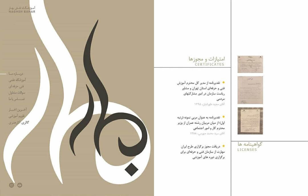
naghsh-bahar.com
2017, web + graphic + logo design
The design and development of the Naqsh Bahar Educational Institute website began with a defining characteristic that shaped the entire creative direction: the site was designed exclusively in Persian. This decision became the foundation for the visual identity and graphic structure of the website. Accordingly, the logo was designed based on Persian script, and the layout of the pages explored the typographic and spatial potentials of Persian text. The overall structure of the website consisted of four main sections. The first included the pages “About Us,” “Scientific and Vocational Institute,” “FAQ,” and “Contact Us.” The second section, “News,” followed a blog-style format, while the other two ( “Academic Calendar” and “Art Gallery” ) were designed to blend seamlessly with the main sections, maintaining a cohesive visual rhythm throughout the site. In the user experience, visitors would first see a composition of artworks subtly displayed behind the logo on entry. As users navigated through the different sections, the color scheme of the logo changed, creating a sense of movement and visual variety within a minimal framework. Upon entering the “Art Gallery” section, the logo gently shifted aside, allowing the artworks to transition from background to foreground, creating an immersive and interactive visual experience.
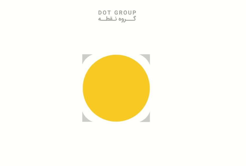
dotgroupstudio.com
2019, web design and development
ِDOT Group is a studio specializing in environmental design, graphic design, and product design. Their logo features a yellow circle accompanied by four shapes positioned at its corners, with the yellow circle itself symbolizing the "point." The design and development of their website was carried out in close alignment with this logo, as well as the studio's visual identity and overall brand. The homepage is intentionally simple and minimal, showcasing only the yellow circle. This circle acts like the beam of a flashlight, giving the sense of guidance, as if it helps us find our path and destination within the website. The website is fully bilingual and designed to provide a dynamic, engaging, and interactive user experience across both languages. Navigation between different sections is powered by AJAX technology. In simple terms, AJAX allows the website to update content quickly and smoothly without fully reloading the page, enabling users to move seamlessly between sections without interruptions.
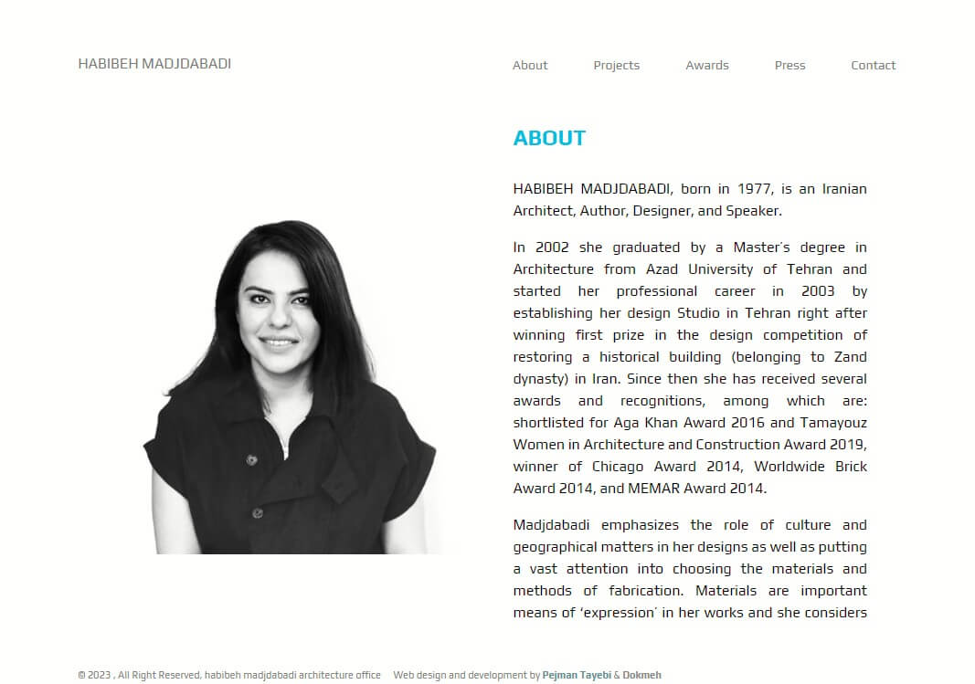
Habibehmadjdabadi.com
2017, original designer : DOKMEH
The web development for Habibe Majdabadi Architecture Studio was not a full “design from scratch” project. Instead, it involved developing and updating a website previously designed and programmed by the Dokmeh team, with the overall structure already in place. During this process, the layout and structure of the homepage and the projects section were mostly preserved. In these sections, our focus was primarily on improving the mobile user experience and increasing the page loading speed. The “About Us,” “Contact,” and “Publications and Awards” sections were completely redesigned and programmed. For the Awards page, we added the ability to browse, flip through, and access each award directly via links. On the Publications page, a structured listing system was created to present videos, magazines, and other content in organized categories for the user. Finally, the website’s back-end was completely rebuilt, enabling the studio team to easily add, remove, and manage projects.
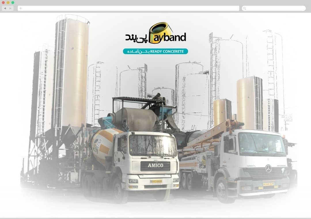
Payband.co
2017, web + graphic + logo design
The project for Payband Ready-Mix Concrete Company was not limited to creating a website; it also included the design of the logo, visual identity, and even the architectural design. In the logo design, our goal was to merge Persian and English typography into a single, unified composition that integrates both scripts with the form of a concrete mixer. The primary brand color was yellow, with teal green as the secondary color. This combination was chosen to reflect both the industrial strength of concrete production and a sense of warmth and friendliness. During the website design and development, we faced a unique challenge: the main product was concrete, which is not inherently visually appealing. To address this, we decided to use graphic illustrations instead of real photos, depicting mixers, silos, and production machinery in a friendly, stylized, cartoon-like way. This concept was further developed through the use of an alphabetical scrolling system and parallax effects, where different page elements move at varying speeds while scrolling, creating a sense of depth and motion.
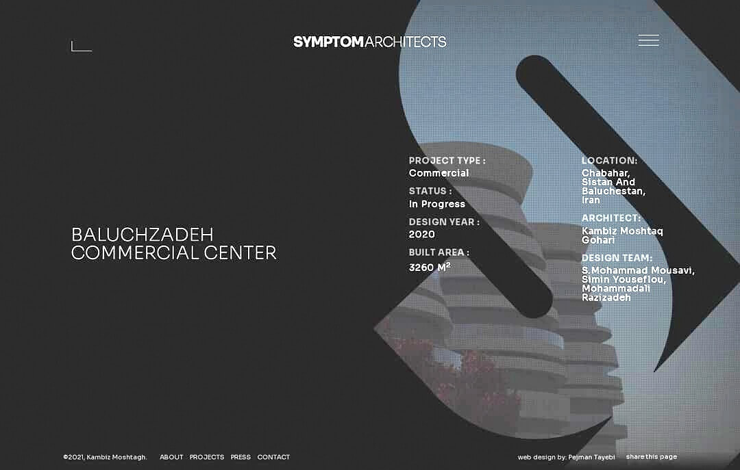
symptomarchitects.com
2020, web design and development
Dr. Kambiz Gohari wanted a website that effectively showcased two main areas of value: first, a section to introduce and display completed architectural projects, and second, a section for sharing and accessing his scholarly articles and publications. The website’s design and development focused on a user experience that allowed visitors to navigate freely within the site. By moving horizontally to the left and right, users could access the projects and articles sections, while vertical movement up and down led to the "About Us" and "Contact" sections. This structure created a sense of interaction and curiosity, making browsing feel similar to exploring a physical space. This flexible and freeform navigation gives users both a sense of discovery and control, providing a unique experience of exploring projects and articles while maintaining a consistent visual identity throughout the site. In the projects section, images and renders were enhanced with subtle motion effects and small animations, allowing visitors to interact with the projects in a dynamic and engaging way. The projects section was also designed with horizontal scrolling to provide a dynamic and immersive experience. AJAX technology was used to navigate between sections. Simply put, AJAX allows the website to load content quickly and dynamically without fully refreshing the page, enabling users to move seamlessly between sections without interruption.
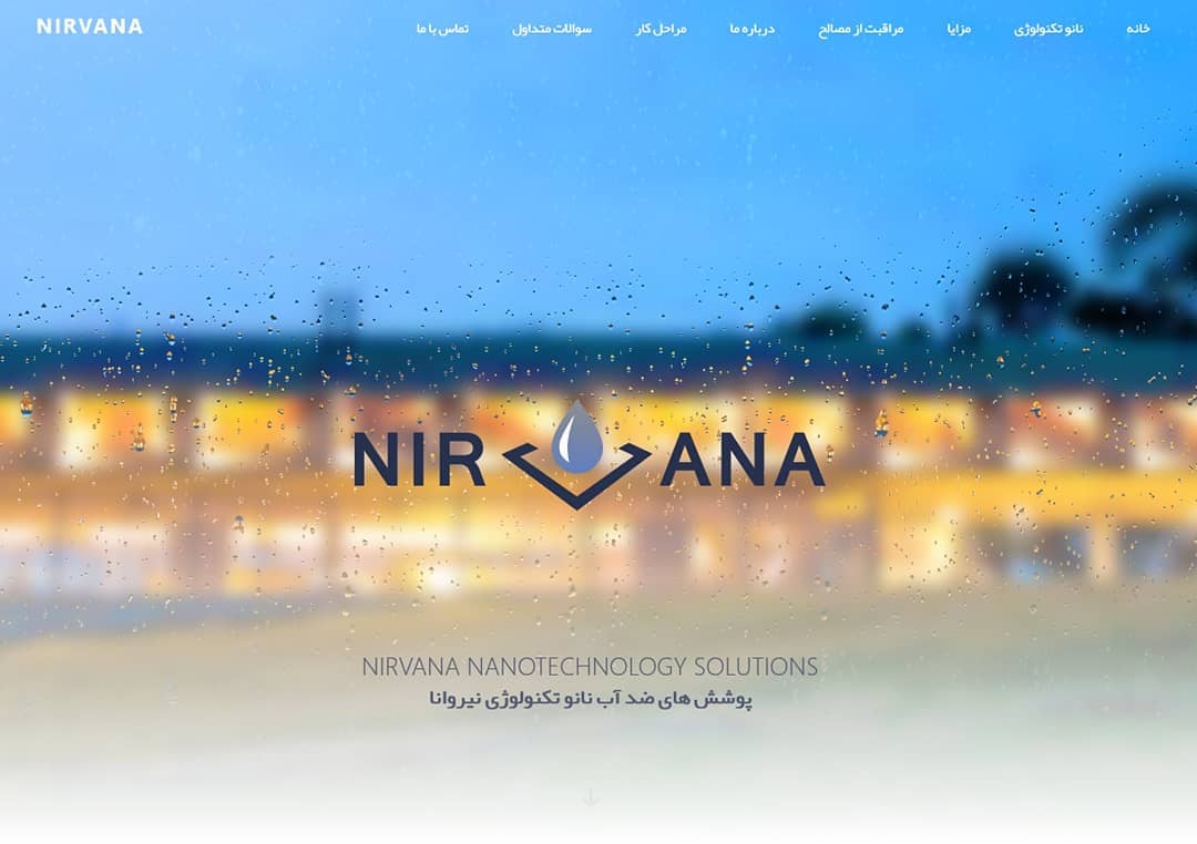
Nanonirvana.com
2017, web + graphic + logo design
Nirvana was a company specializing in surface waterproofing through nanotechnology. Its main goal was to prevent water droplets from remaining on different surfaces. The design project for Nirvana included three parts: logo design, visual identity, and website design. Throughout the process, our focus was to express the invisible yet powerful nature of Nirvana’s work through a clear and tangible visual language. Since the company offered no physical product, we chose water as the central concept for its identity. The logo drew inspiration from the smooth motion of water droplets, a theme that extended into the website’s design. Colors, layouts, and animations were carefully composed to evoke a sense of flow, clarity, and lightness. just like a surface that repels water naturally. On the homepage, visitors encounter a quiet, poetic image: raindrops sliding gently across a window overlooking a calm, bright landscape. This scene reflects the essence of the brand: protection from water, while preserving the beauty and softness of the rain. The overall experience combines technology, precision, and subtle emotion. To simulate the natural movement of water on glass, we used WebGL, bringing a sense of depth and realism directly into the browser. WebGL, or Web Graphics Library, is a web-based technology that allows developers to create 3D visuals and animations without external plugins. This approach made the interaction of water droplets on the Nirvana website feel organic and responsive, turning a technical concept into an engaging, sensory experience.
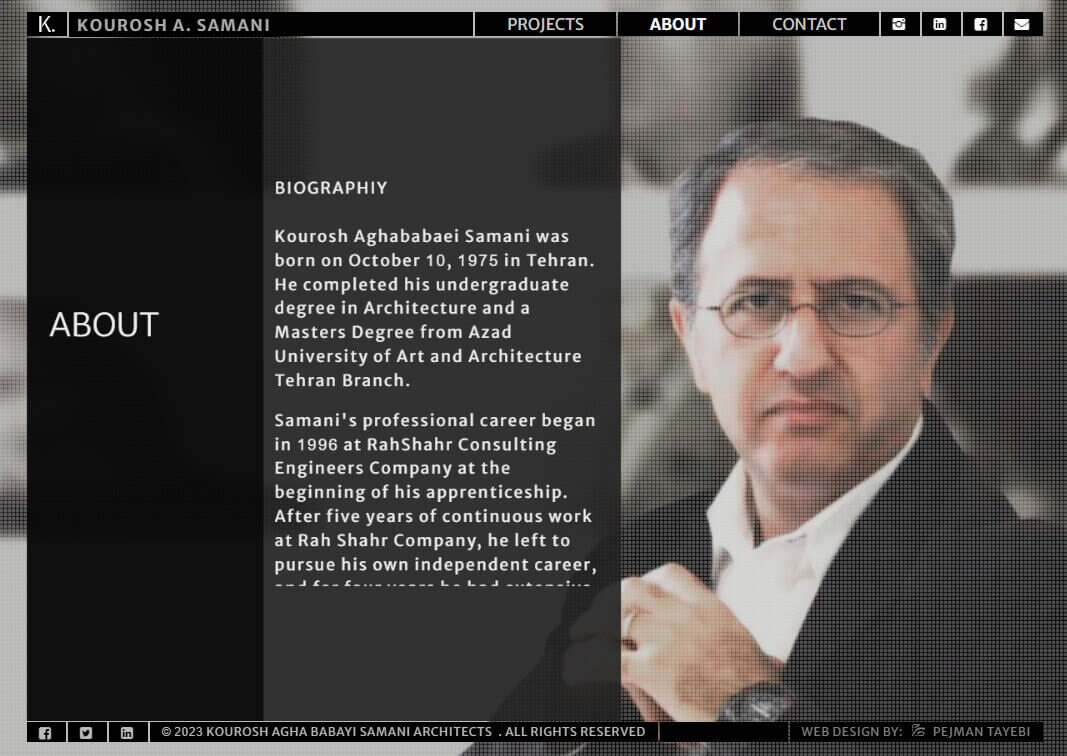
Kouroshsamani.com
2018, web + graphic + logo design
The Korosh Samani website project initially began as a straightforward web design and development assignment. However, during the process, we realized that he did not have an existing logo or visual identity system. We therefore decided to design one free of charge, as a complementary part of the project. The logo was simply derived from his name, crafted in a custom typeface that balanced simplicity and elegance. The visual identity of the website was shaped through a palette of dark tones and a formal, refined composition, intended to convey a sense of sophistication, precision, and professionalism. Every design element (from the color choices to the typography) was aligned to reinforce this overall mood. In the design and development of the website, our main goal was to create a full-screen, immersive experience. We wanted visitors to engage directly with the content from the very first moment, rather than being distracted by the usual frames and borders of a conventional webpage. For this reason, interface elements such as the header and footer (commonly placed at the top and bottom of a page) were reduced to their most minimal forms, ensuring they would not interfere with the user’s focus. As a result, the website achieved a clean, seamless, and borderless atmosphere that draws the visitor immediately into the content and the spirit of the brand. Since the homepage featured numerous large-scale images, it was necessary to reduce their file sizes to maintain fast loading speed. However, compression often leads to a noticeable loss in quality. To address this, we placed the images in the background and added a subtle dotted overlay pattern in the foreground, which softened the visual noise and created a pleasant texture while masking the reduced quality.
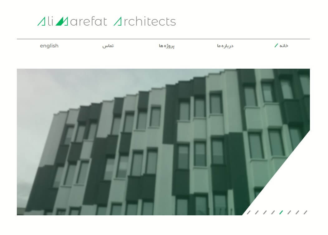
Alimarefat.com
2019, web + graphic + logo design
This project was created for architect Ali Marefat and began with the design of his logo and visual identity. He wanted the set square, a classic drafting tool used in hand-drawn architectural plans, to serve as the central element of his brand identity. Since we handled both the logo design and the website development, we created a meaningful connection between the two. On the homepage the logo comes to life through motion: it starts as a triangular form that evokes the set square, and then the letters A and M gradually emerge, revealing that the triangle is actually formed by the initials of Ali Marefat. The website design follows the same concept. On the main page the slider includes a triangular cutout in one corner, and diagonal lines and slanted graphic elements (/) are used across the site to maintain a consistent visual rhythm that ties the layout to the logo and overall identity. Because the homepage included several large images, we needed to optimize their file sizes to improve loading speed without noticeably sacrificing quality. To achieve this, images were placed in the background and a subtle dotted overlay was added in the foreground to mask compression artifacts and create a pleasant textured effect.
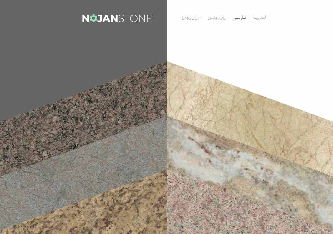
nojan stone
2021, web design and development
The visual identity and website development for Nojan Pergas Stone Company were guided by an interesting request. While the client’s original logo resembled a saw or a stone-cutting blade, they wished the design to include a subtle and poetic reference to a pine tree, symbolizing nature, endurance, and growth. The homepage and stone catalog were designed as a visual interpretation of this idea. Stones were arranged in a pine-like rhythm, accompanied by a soft and fluid animation that echoed the natural balance of a tree’s form, merging the raw strength of stone with the organic grace of nature. In the “Stones” section, casual visitors could view approximate prices, while registered users gained access to detailed information and precise pricing, creating a balance between openness and exclusivity that reflected the brand’s professional approach. The website also included a “Knowledge Base” section, powered by a custom-built blog management system developed specifically for this project. This feature allowed the client to share insights, expertise, and design stories with their audience. Due to the company’s closure during the COVID-19 pandemic and a shift in business direction, the main website is no longer active. However, an archival version with limited content remains available on this server for exploration.
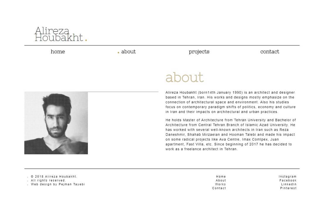
alireza hoobakht
2017, web + graphic + logo design
If we were to describe the design and development project of Architect Alireza Hobakht’s website, it could be defined as a simple, straightforward portfolio site: free of unnecessary ornamentation, focusing instead on clarity and ease of use. We selected two main typefaces, and the entire visual structure of the website was built around them. Since the homepage featured numerous large-scale images, it was necessary to reduce their file sizes to maintain fast loading speed. However, compression often leads to a noticeable loss in quality. To address this, we placed the images in the background and added a subtle dotted overlay pattern in the foreground, which softened the visual noise and created a pleasant texture while masking the reduced quality. Alireza Hobakht is currently based abroad and works with international firms. The original website is no longer active, but a simplified archival version with limited content remains accessible on this server, where you can browse and explore its preserved layout.
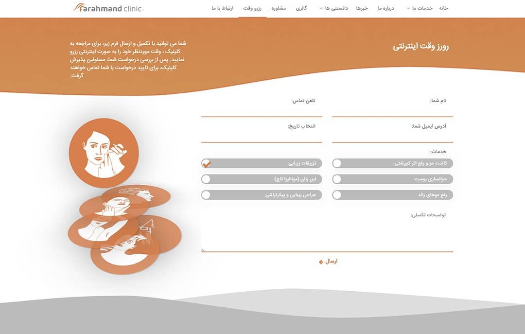
farahmand clinic
2016, web + graphic + logo design
When Farahmand Skin and Hair Clinic approached us, they already had a website. Our goal was to create a refreshed version that felt familiar to returning users while offering a modern, interactive experience. Much of the original structure was retained to avoid confusion. Although creating a new logo was not part of the initial plan, we couldn’t overlook it. The clinic’s existing logo lacked visual appeal, but it had been in use for years and was strongly tied to their brand identity, so a complete replacement was not an option. We kept the core structure of their logo but refined its geometry and graphics, adding curved lines reminiscent of hair to modernize and enhance the brand’s visual identity. For the website, we moved away from conventional templates to create an interactive experience. The “Before and After Hair Transplant” section allows users to explore transformations by moving their mouse or touching the screen, providing a dynamic and engaging sense of the treatment results. Due to the company’s closure during the COVID-19 pandemic and a shift in business direction, the main website is no longer active. However, a archival version with limited content remains available on this server for exploration.
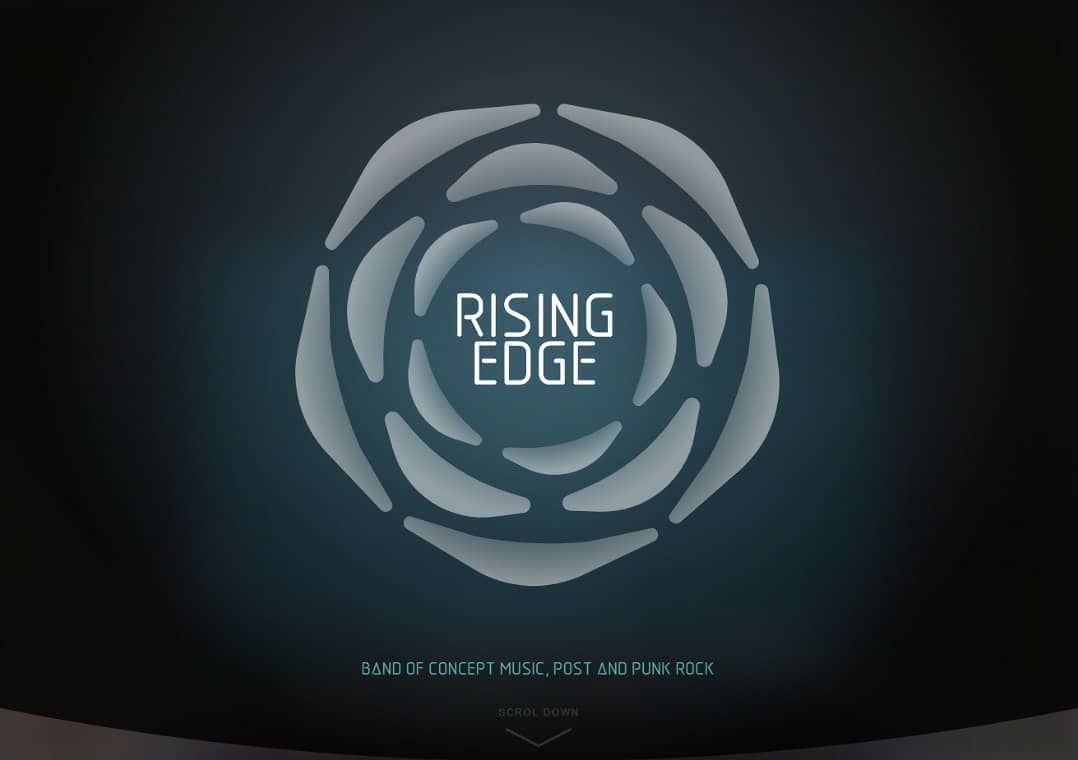
risingedgemusic.com
2016, web + graphic + logo design
Since I, Pejman Tayebi, was once a member of the music group Rising Edge, so of course I handled the logo design as well as the design and development of their website. "The idea of 'Rising Edge' captures the moment when momentum begins, a spark of movement that grows into something bigger, leading to a point of opportunity and transformation." In designing the logo, we aimed to visually express these ideas. We also programmed a motion graphic for the logo so that users could interact with it, rotating around the “point” by moving their mouse. For the website, a music player and a video player were also designed and developed, allowing users to easily listen to the group’s songs and watch their videos.
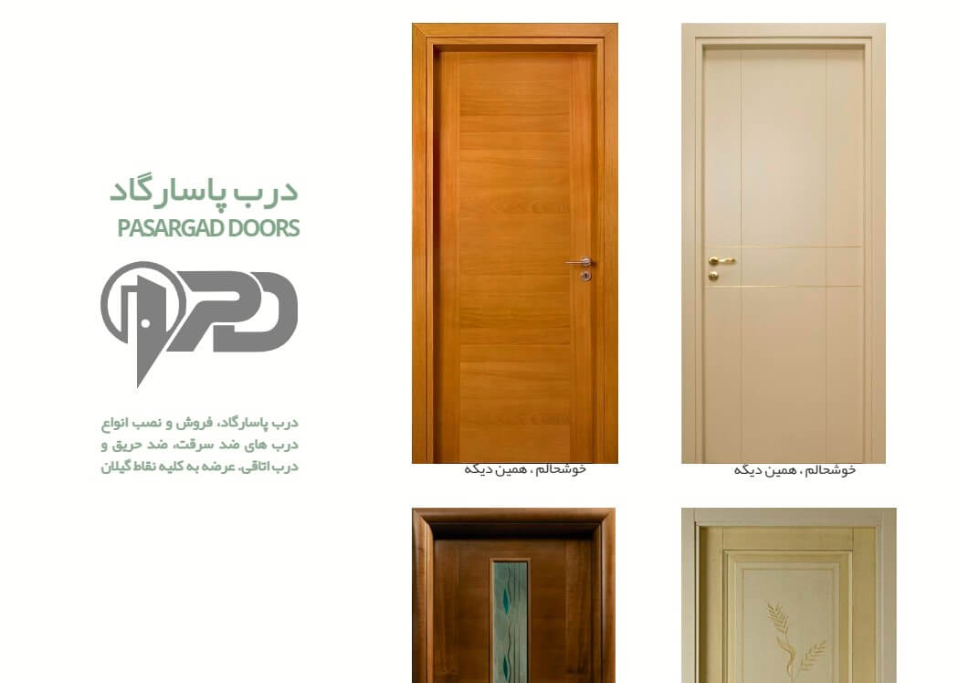
passargad door
2015, web design and development
The design and development of the Darb Pasargad website was centered on conveying the concept and feeling of a “door.” Upon entering the site, the user is immediately presented with an image of a door. During page loading, the door remains closed, and once the loading is complete, it slowly opens, creating the sensation of stepping into a space. Next, a series of doors (representing products) are displayed. When the user hovers over each door, it opens with a smooth and playful animation, revealing information about the product and creating an engaging interactive experience. Due to the company’s closure during the COVID-19 pandemic and a shift in business direction, the main website is no longer active. However, a simplified archival version with limited content remains available on the same server for exploration.
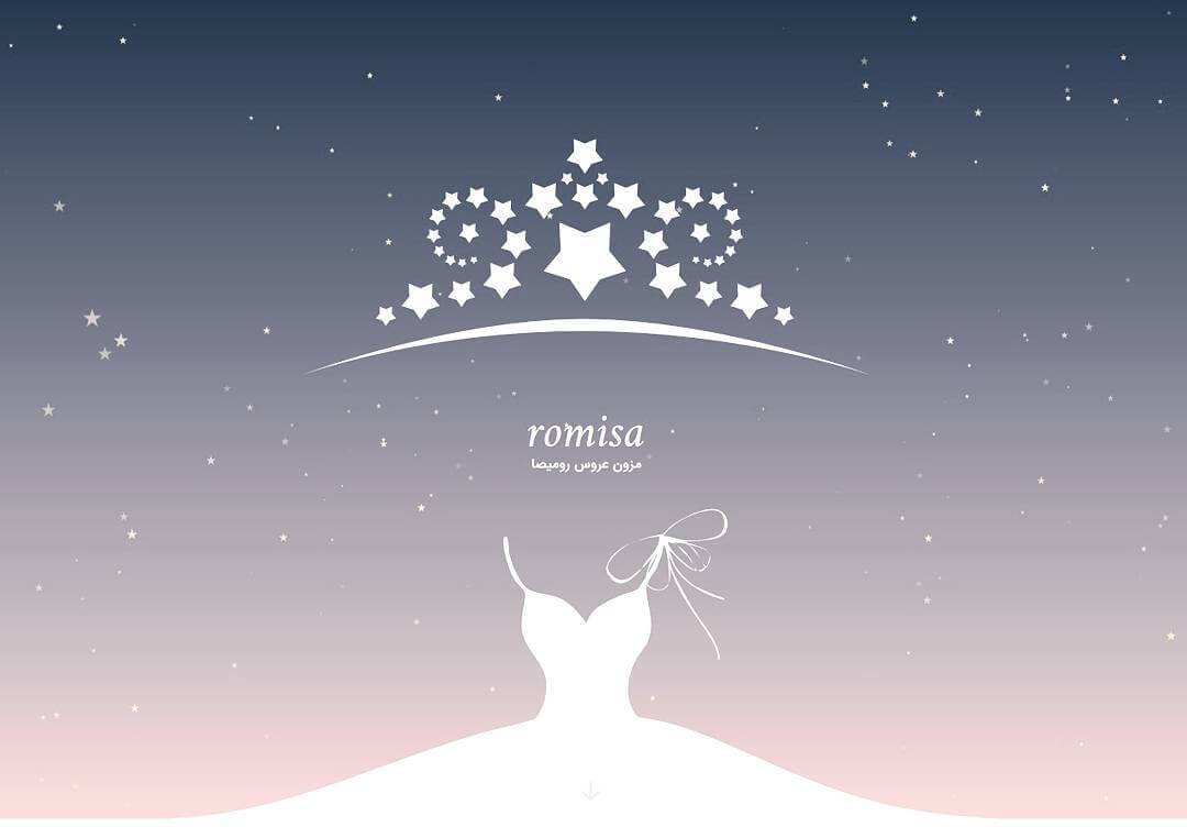
Romisa Wedding Dresses
2015, web + graphic + logo design
This project involved the design of the logo, visual identity, and the complete web design and development for Romisa Bridal Boutique. The process began with the logo design. Since both the logo and the website were developed by our team, we designed the logo from the very beginning with the idea that it could later come to life through motion and animation, seamlessly integrating into the interactive website experience. The logo design was based on two main ideas. The first was to incorporate a “bridal crown” symbol so that the brand could be instantly recognized as a bridal boutique. The second was to draw inspiration from the delicate details of a wedding gown. To express this, star-like motifs were used throughout the design, evoking the sparkle and elegance of a wedding night. During the web design and development phase, the idea of the stars was expanded, becoming an interactive part of the user experience. To achieve this, a particle system was developed. In simple terms, particles are small graphic elements that move dynamically across the screen, simulating natural motion such as dust or light. On the website, these particles appear as stars that follow the cursor’s movement, and when clicked, they create a lively and visually engaging animation.
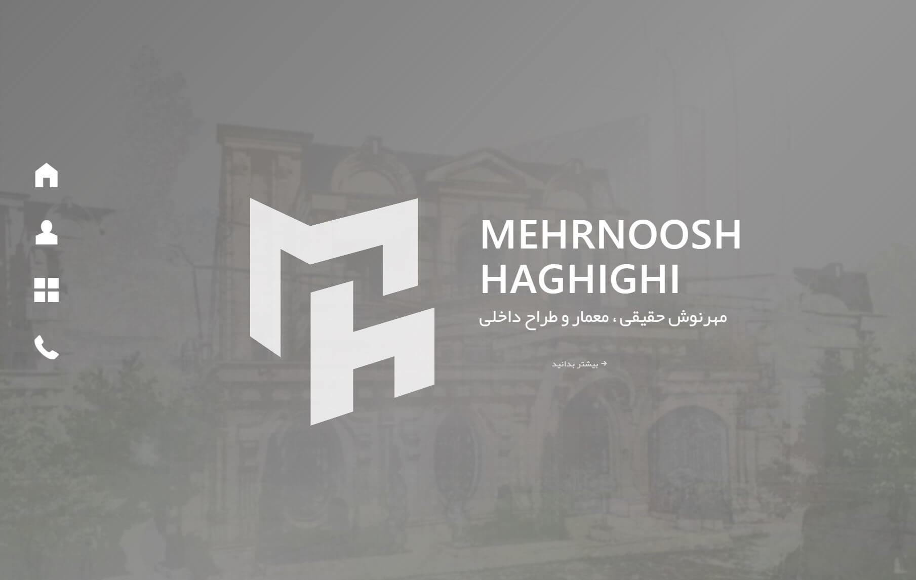
mehnoosh haghighi
2017, web + graphic + logo design
This project involved the logo design and website development for Ms. Mehrnoosh Haghighi, Architect. The work began with the logo; because we were responsible for both the logo and the website, we designed the mark from the outset so that it could later be brought to life with motion and animation and be seamlessly integrated into the site. The logo was built around the letters M and H (the initials of Mehrnoosh Haghighi) while also aiming to convey an idea of architecture. One might say that "architecture is the art of playing with volume and form", and this logo attempts to express that concept graphically. Placing M and H together creates a cube-like form, and on the website the user can interact with these letters by hovering the cursor over either one, moving them and playfully engaging with the forms. This website was one of our early projects completed in the year 1396. Naturally, its design may appear simple by today’s standards, but at the time it was developed with an approach that ensured it would run without issues on the older Internet Explorer 8 browser, which was a significant technical challenge then.